CASE Study
Less Thinking,
More Parking.
Product Design
2025
Deliverables
Interactive Prototype · User Flow · Paper Prototype Iterations

01 · Overview
Reimagining San Francisco's Parking Meter Experience
Parking should take seconds. Instead, drivers are asked to remember license plates, interpret parking rules, and complete payment while standing on a busy sidewalk.
This project explores how interaction design can reduce cognitive load in an everyday civic experience.
02 · PROBLEM
Parking asks users to think too much.
Street parking seems simple, but the experience places unnecessary mental work on users during a task that should take less than a minute.
DRIVERS MUST
Remember their license plate
Decode confusing parking rules
Rush through payment
Hope they didn't make a mistake
"Remembering my license plate is surprisingly annoying."
That single observation became the foundation for the redesign.
03 · DESIGN THESIS
The challenge wasn't to redesign a parking meter—it was to reduce the amount of thinking required to use one.
Every design decision that follows addresses a different source of that load: memory, information overload, and uncertainty.
Turning Insights Into Design
Rather than documenting every artifact chronologically,
I focused on how research informed each design decision.
04 · INSIGHTS
INSIGHT 1
Drivers rely on memory when they shouldn't have to.
Users often forgot their license plate after walking away from their vehicle, forcing them to return to their car or memorize a number before approaching the meter.
INTERVIEW
"Remembering my license plate is surprisingly annoying."
Jenna, CCA Student
Drives daily to campus
OBSERVATION
Observed student parking at the meter.
parked vehicle
walked toward meter
paused
inserted card
payment was not accepted
card was reinserted
finished payment, student walks away
Location: Near CCA Campus
October 8, 2025, 10:33 AM
Concept Development
Storyboarding the transition from recall to recognition. Initially, the idea is that you pay on an app, but since the deliverable is a redesigned park meter, that became myconstraint.

Design Response
Rather than relying on memory, I explored how recognition could replace recall. By allowing registered vehicles to be identified automatically through RFID, the interaction shifts from remembering information to simply confirming it.

Design Principle
Recognition is easier than recall.
INSIGHT 2
Designing Around Information, Not Rules
Users struggled to understand parking restrictions because important information competed for attention. Time limits, pricing, and restrictions were presented simultaneously, making it difficult to determine what mattered in the moment.

CURRENT PARKING SIGN
Multiple rules all at once
different time windows
Exceptions & permits
Buried restrictions
Hard to know what matters at the moment
Information Mapping

Design Response
I reorganized parking information around the driver's immediate step—revealing time limits, pricing, and restrictions only when each became relevant.
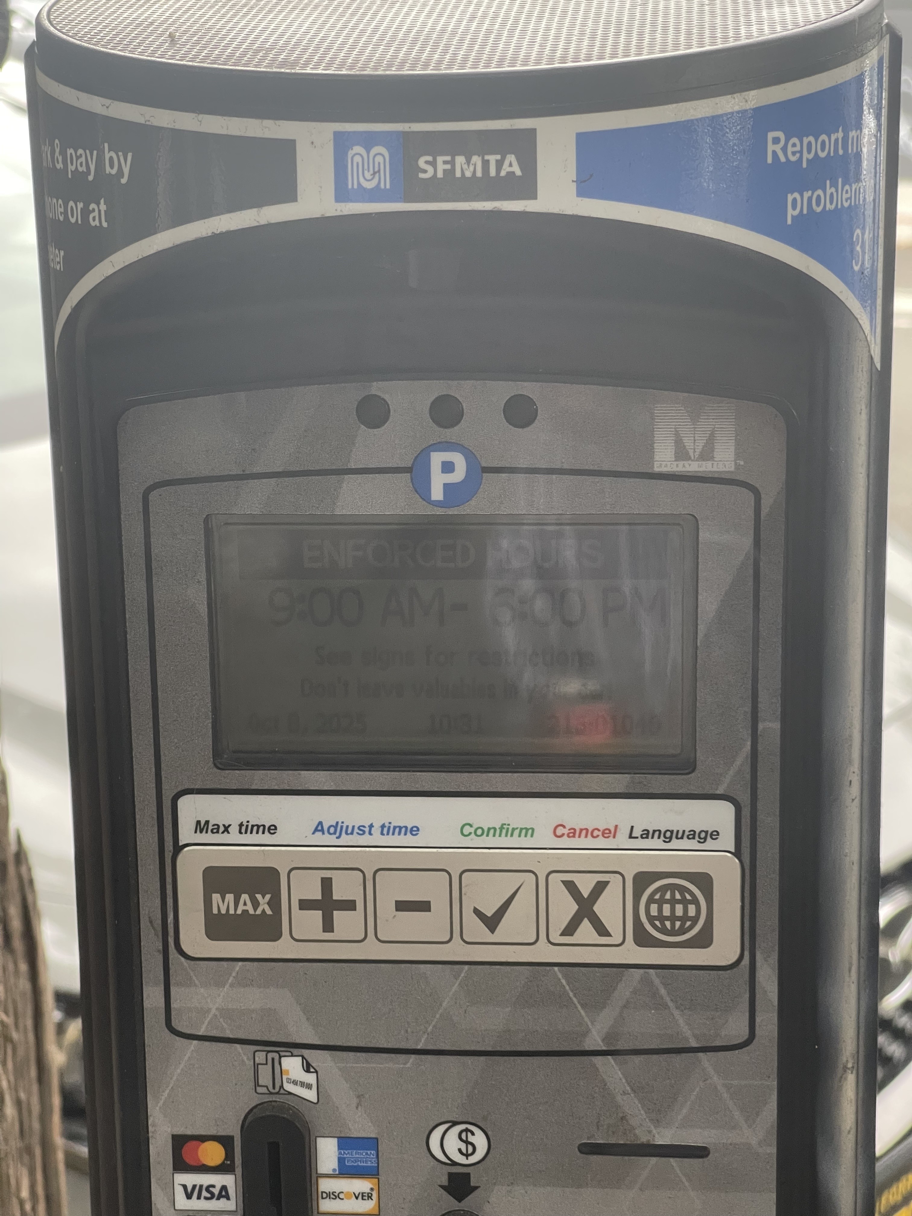
Current Meter
One interface for every parking scenario
Drivers must interpret parking signs themselves.
The meter doesn’t explain whether parking is allowed.

Context-Aware Interface
One interface that adapts to the moment.
Parking Available
Street Cleaning
Free Parking
Event Parking
Design Principle
Information should appear when it's needed—not all at once.
INSIGHT 3
Uncertainty shouldn't be part of parking.
"I wasn't sure if it actually went through."
Even after paying, users still questioned whether their parking session had started. When the cost of being wrong is a parking ticket, uncertainty becomes part of the interaction.
Exploration
(Payment flow sketches, confirmation concepts, progress indicators.)

Design Response
I redesigned the confirmation experience with clearer system feedback and visible success states, so users always know when their parking session is active.

Design Principle
Confidence is part of usability.
05 · North Star Vision
Looking Beyond Today's Constraints
Once I had redesigned today’s parking experience, I stepped back and asked a bigger question:
What if parking wasn't constrained by today's infrastructure?
Rather than requiring drivers to manually enter their license plate, registered vehicles could identify themselves automatically through RFID. Parking becomes nearly invisible—drivers simply park, confirm their duration, and pay.
Concept Diagram
Evaluating the Concept
Rather than asking whether the idea was immediately buildable, I evaluated it through the lens of product design.
😊 User Experience
★★★★★
Eliminates one of the largest sources of friction.
🏛️ Infrastructure
★☆☆☆☆
Requires hardware, policy, and operational changes.
🛠️ Technical Feasibility
★★☆☆☆
Requires city-wide infrastructure updates.
🚀 Future Potential
★★★★★
Connected vehicles make this increasingly plausible.
Why Explore This Vision?
This wasn’t intended as an implementation proposal. It was an exercise in defining the ideal experience before evaluating today’s constraints. While RFID would require significant infrastructure investment, exploring the concept clarified which ideas could improve the current experience today—and which represent a longer-term product vision.
North Star concepts aren't roadmaps—they're direction. Exploring this concept helped separate the ideal experience from today's constraints.
06 · FINAL PROTOTYPE
The final prototype brings together each design decision into a parking experience that reduces unnecessary cognitive effort while improving clarity, accessibility, and user confidence.
07 · REFLECTION
What I learned
Designing public infrastructure taught me that the best interfaces are often the ones users barely notice.
Rather than solving every challenge within San Francisco’s parking system, I learned that meaningful interaction design often comes from reducing effort rather than adding features.