Case Study
Stick Together
Brand System & Visual Identity
2025
Deliverables
Brand Guidelines · Logo System · Event Signage · Digital & Print Applications

01 · Overview
At a Glance
Stick Together is a community-centered sticker fair designed to make creativity feel approachable. Inspired by collecting, trading, and making, the identity transforms participation into a playful visual system that scales across print, digital, and environmental experiences.
02 · OPPORTUNITY
Problem
Creative events often prioritize browsing over participation.
Insight
People participate more when creative spaces feel welcoming and low-pressure.
How might we…
Design a visual identity that encourages participation instead of passive browsing?

03 · RESEARCH
Research through three key questions
Instead of designing another marketplace, I wanted to understand what makes creative communities feel welcoming, participatory, and memorable.
My research explored existing sticker events, independent stationery culture, production methods, and community-centered creative spaces to identify opportunities for a more collaborative experience.
01
What already exists?
How are sticker fairs typically experienced today?
shopping-first experience
limited opportunities for interaction
identity focuses on products over people


02
What makes people want to stay?
What makes creative spaces feel welcoming instead of transactional?
warm, approachable environments encourage exploration
handmade details make spaces feel personal
shared activities create stronger community than shopping alone


Welcoming & Participatory Space


Transactional & Passive Experiences
03
How is sticker culture expressed?
How do makers present, package, and celebrate their work?
materials and textures communicate quality and care
print methods bring personality and authencity

Avery Colored Label

Waterproof Water Bottle Stickers

Planner Stickers

Sticker Sheet

DIY Stickers

Scratch N Sniff

Bumper Stickers

Holographic Material

Die Cut
Research Takeaways
Research showed that successful creative communities share three qualities:
Participation over consumption
People want to do, not just buy.
Handmade over polished
Imperfections and human touch create real connection.
Community over commerce
Spaces designed for people, not transactions.
04 · Design principles
Four principles guided every design decision.
Playful
Lower the barrier to creativity through expressive visuals and approachable interactions.
Collective
Design opportunities for people to create, trade, and connect together—not just browse.
Accessible
Use clear communication and intuitive experiences so anyone feels comfortable participating.
Tactile
Celebrate the warmth of paper, printmaking, and handmade production throughout the experience.
05 · Visual System
A modular kit for low-pressure making.
Inspired by sticker sheets and community workshops, the identity transforms collecting into a flexible visual system that feels approachable across every touchpoint.
IDENTITY
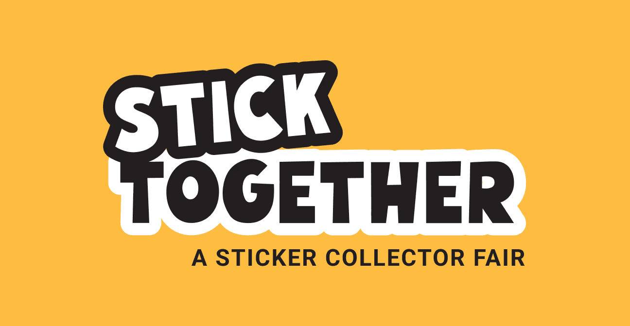
More than a single mark.
A flexible family of lockups adapts across formats while maintaining one playful, recognizable identity.




TYPOGRAPHY
Designed to invite.
A high-contrast display type brings personality, while a clean sans serif keeps information clear and accessible.
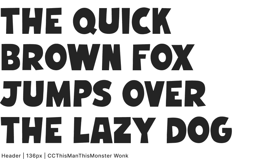


Typography balances warmth with readability, allowing expressive headlines to coexist with practical event information.
COLOR SYSTEM
Built for warmth.
Inspired by paper, ink, and craft materials, the palette creates a warm, tactile atmosphere across every touchpoint.

Palette Explorations


Pairing
+
Accessibility Testing

After applying the palettes to the icon system, I chose the higher-contrast colors as a nod to classic AVERY label stickers.


ICONOGRAPHY
Built for interaction.
Simple icons extend the identity while helping visitors create, trade, and collect with confidence.


Each icon was built by extracting and recombining shapes from the display typeface, creating a visual language that feels inherently connected to the typography.

Trade
Create
Collect
After several iterations, the icon system distilled the festival into three core actions: Create, Trade, and Collect.
05 · APPLICATIONS
Bringing the identity to life.
Rather than functioning as a collection of individual assets, the visual system supports the entire event experience—from welcoming visitors into the space to encouraging participation and giving them something memorable to take home.


05 · Reflection
What Worked
Warmth and approachability gave the system a clear point of view without needing excessive decoration.
What I’d Improve
More tactile details could make the speculative event feel even more physical and material-driven.
Key Takeaways
Zooming out from individual deliverables helped restore momentum and strengthen the full system.
Stick Together taught me to design beyond individual deliverables. Building a system meant constantly stepping back, making decisions that strengthened the whole rather than perfecting one artifact. While I’d continue refining production details, the project reinforced how thoughtful visual systems can encourage participation before a single interaction takes place.